 The zApp Interface Pack
 The zApp Interface Pack

Toolbars, generally located along the top edge of the main window, present a set of buttons, edit boxes, and other controls that offer the user quick access to commonly used functionality. The zApp Interface Pack's zToolbar class encapsulates the functionality needed to create a toolbar, and provides an easy means for creating a toolbox or tool palette. Bitmap buttons, all types of controls, and other types of zWindows can be placed within a toolbar. The advanced toolbars included in the zApp Interface Pack support the advanced controls from the Interface Pack including multi-state bitmap buttons and button groups. The toolbar can also be hot-linked to menu items (and the zApp Interface Pack will keep them synchronized) and to help mesages in the status line. zApp Interface Pack toolbars allow for easy declaration of bitmaps as resources in the toolbar, putting toolbars in MDI windows, and creating "floating" toolbars.
In addition to the zToolbar class, a couple of other classes make using toolbars easier. The zSlotSizer class provides a mechanism for positioning items in the toolbar along an imaginary one-dimensional grid. The zButtonGroup enables two-state buttons (i.e., buttons with one and off states) to be automatically managed so that only one button in a group of buttons is on at any one time.

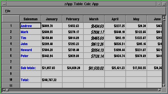
The zTable classes create a windowing object that can be used for displaying and allowing interaction with data that can be expressed in a grid-like format. These classes could easily be their own product, as they provide a complete implementation of a table, including cell alignment (left, center, right), easy-to-add links to databases, and much more. For an object as general as a table, a large number of different features and extensions to the table's functionality are possible. In brief, some of the facilities provided by the Interface Pack's zTable objects include the following:

Incorporating a status line is easy with the zApp Interface Pack. You can display help information about the currently selected item, key states for Caps Lock and Num Lock, the status of a job, or just the date and time.
The zApp Interface Pack's zStatusLineEZ class offers powerful functionality with a simple, yet flexible, interface. Any windowing object derived from zWindow can be placed inside a zStatusLineEZ object, including edit controls, combo boxes, list boxes, and buttons. zStatusItems (which are generic items in the status lines), such as zStatusItemTexts (textual status items), can also be placed inside status lines.
Your status line can be built to be customized by the end user, can be displayed in MDI windows, can automatically display num lock and caps lock indicators, and can easily be used to tie in and display help information related to the toolbar classes.

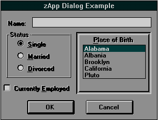
The zApp Interface Pack's 3D customizable controls are often used in place of standard controls to enhance an application's look-and-feel or functionality.
3D controls can also be completely new controls, providing features not found in the standard controls. The 3D controls include frames, panels, static text, radio buttons, check boxes, and group boxes.
The great thing about the zApp Interface Pack's 3D custom controls is that you probably already know how to use them! The 3D controls have the same member functions as their standard zApp control counterparts. For example, to place a check mark in a zCheckBox3d control, call the zCheckBox3d member function check() in the same manner that you would call check() on a standard zCheckBox.
In addition, ZIP's 3D custom controls appear on the toolbox for the Borland Resource Workshop and Microsoft Dialog Editor design environments.

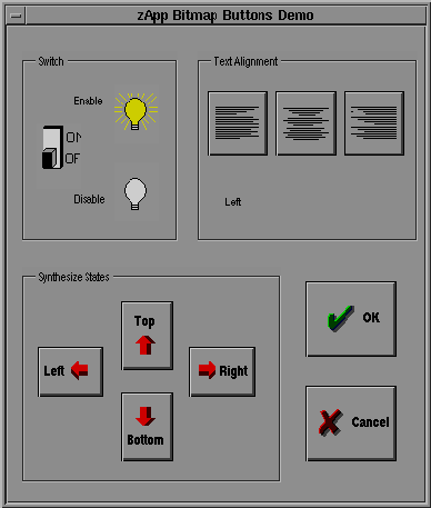
zBitmap Buttons are buttons with pushbutton-like behavior that draw themselves with custom, programmer-provided bitmaps. These objects allow an application to offer pushbuttons that display themselves using highly-customized graphic images.
A zBitmapButton can act either as a one-state button or a two-state button. A one-state zBitmapButton has the same sort of behavior as a pushbutton: when pressed, a single action takes place. A two-state zBitmapButton can be thought of as the software equivalent of a light switch; it is a button that has an "on" state and an "off" state, and pushing the button toggles the button's state.
Bitmap buttons may be used in a dialog, in a toolbar, or in any windowing object, including status lines.


© Copyright 1995, Rogue Wave Software, Inc.